
I am a dedicated fan of Shonen anime series, with a particular interest in One Piece, Naruto, and Demon Slayer. But let’s be honest: committing to a long-running anime is no longer just a casual entertainment choice; it is a massive lifestyle commitment.
Starting a 12-episode seasonal show is a low-risk gamble. Starting a 1,000+ episode behemoth requires hundreds of hours. Time is our most finite resource, yet we often fly completely blind when choosing what to watch, relying on subjective hype rather than objective metrics.
I actively develop local-first software applications and program data-driven automation pipelines, so I naturally approached this problem through the lens of data science. I wanted to move away from the “is this a good show?” debate and answer a more practical question: “Is this worth my time?”
That’s why I engineered the Anime Time-ROI Matrix. Here is exactly how I built it, the Python pipeline that powers it, and how the data reveals the true cost of our favorite shows.
The Architecture: A Privacy-First Approach
In keeping with the “Anti-SaaS” philosophy, this tool doesn’t require you to create an account, it doesn’t scrape your viewing history, and it doesn’t run on an expensive cloud server. It consists of two distinct, decoupled layers:
- The Data Pipeline (Python): A local script that queries the AniList GraphQL API, cleans the data, merges fragmented seasons into unified franchises, and outputs a static JSON file.
- The Dashboard (HTML/JS): A lightweight, browser-based frontend using Chart.js that reads the JSON file and renders the interactive matrix entirely on your local machine.
Building the Data Pipeline (The Python Backend)
1. Extracting Data with GraphQL
Most REST APIs require you to make multiple endpoints requests to gather show details, episodes, and scores. I used the AniList GraphQL API because it allows us to request exactly the shape of the data we need in a single payload. However, parsing a massive database requires robust error handling, specifically for Rate Limiting (when an API tells you to slow down because you are making too many requests).
Instead of letting the script crash when hitting the limit, I implemented a self-healing retry loop:
# Robust Retry Logic for API Rate Limiting
while retries > 0:
    try:
        response = requests.post(ANILIST_URL, json={"query": query, "variables": variables}, timeout=15)

        # Handle 429 Too Many Requests Gracefully
        if response.status_code == 429:
            wait_time = int(response.headers.get("Retry-After", 5))
            print(f"  -> Rate limited! Waiting {wait_time} seconds...")
            time.sleep(wait_time + 1)
            retries -= 1
            continue

        response.raise_for_status()
        data = response.json()
        media_list = data.get("data", {}).get("Page", {}).get("media", [])
        break # Success, exit retry loop
2. Feature Engineering: The “Math Drift” Problem
Anime data is notoriously messy. A single show like Attack on Titan is broken into multiple seasons, parts, and “final chapters.” To calculate the true Time-ROI, we have to group these disparate entries into a single Franchise entity.
During development, I encountered a classic data-science problem: Math Drift. If you calculate the hours for Season 1 (rounding up), then Season 2 (rounding up), and add them together, your final total becomes inaccurate due to compounding rounding errors. The solution? Calculate the absolute raw baseline first.
# Accumulate raw minutes instead of rounded hours to prevent math drift
total_mins = episodes * duration_mins
canon_mins = canon_episodes * duration_mins

# ... aggregation logic ...

# Do the division and rounding ONLY at the very end of the pipeline
f["total_hours"] = round(f["total_mins"] / 60, 2)
f["canon_hours"] = round(f["canon_mins"] / 60, 2)
3. Scrubbing the Noise (Filler Episodes)
Not all episodes are created equal. A show might have 500 episodes, but if 40% of them are non-canon filler, the raw time investment metric is skewed. I created a manual FILLER_COUNTS_BY_ID dictionary to deduct these empty calories from the total runtime, allowing us to map the “Canon Hours” alongside the “Total Hours.”
Building the Frontend Dashboard
The resulting anime_data_merged.json dataset is fed directly into a vanilla JavaScript frontend. No React overhead, no complex dependencies—just raw performance.
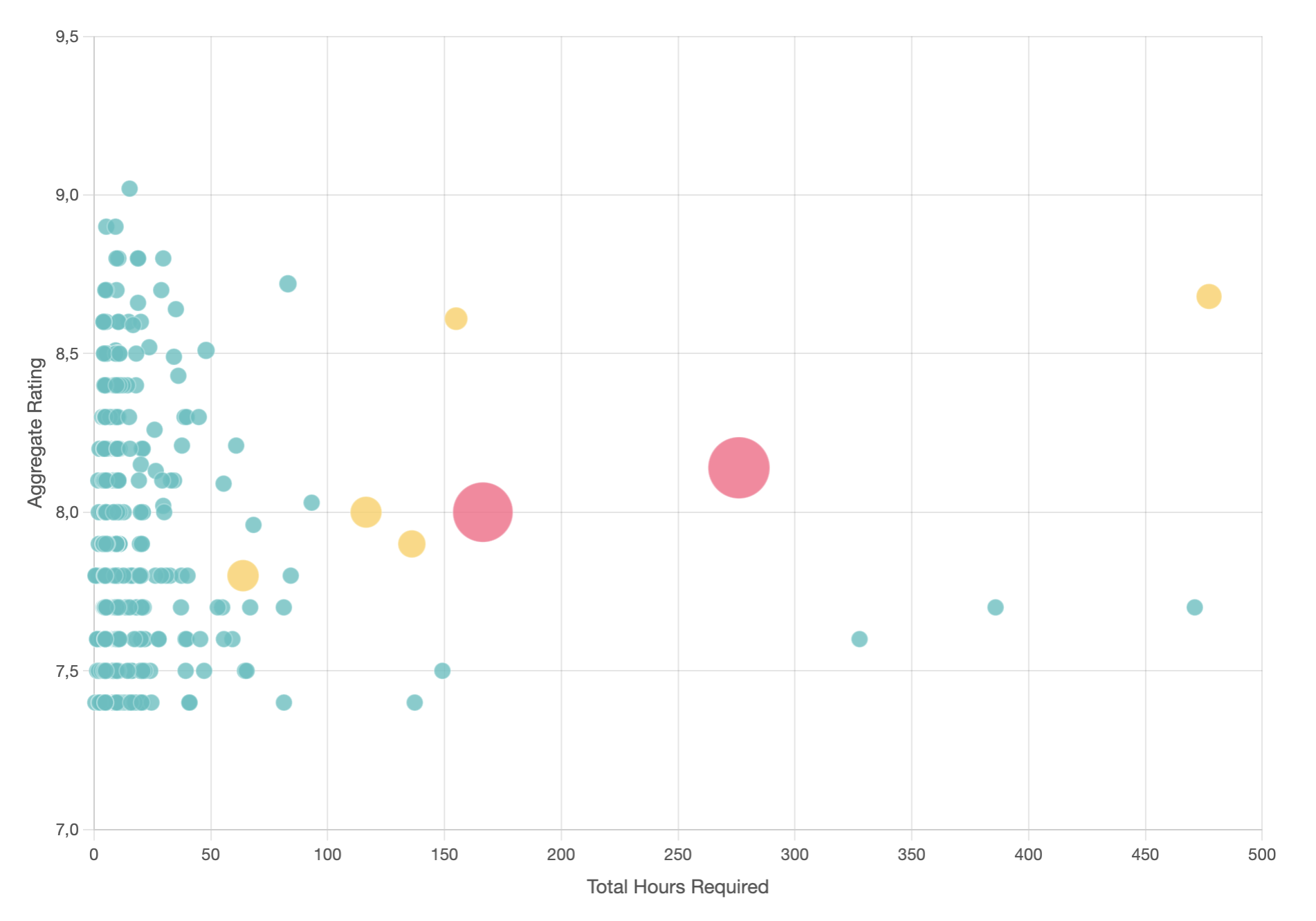
To visualize the Time-ROI Matrix, I used a Chart.js Bubble Chart. In data science, mapping multiple dimensions on a 2D plane requires creative use of visual elements. Here is how the variables are mapped:
- X-Axis (Time Investment):
total_hours - Y-Axis (Emotional Return):
score(Aggregate rating) - Bubble Size: Represents the volume of filler episodes.
- Bubble Color: Acts as a heatmap for the filler percentage.
// Heatmap logic based on filler percentage
function getBubbleColor(fillerPct) {
    if (fillerPct < 5) return 'rgba(75, 192, 192, 0.8)';   // Low Filler (Teal)
    if (fillerPct < 15) return 'rgba(255, 206, 86, 0.8)';  // Medium Filler (Yellow)
    if (fillerPct < 30) return 'rgba(255, 159, 64, 0.8)';  // High Filler (Orange)
    return 'rgba(255, 99, 132, 0.8)';                      // Heavy Filler (Red)
}
Real Examples: Mapping the Heavyweights
When we run our Shonen heavyweights through the matrix, distinct clusters (or archetypes) emerge:
Demon Slayer (The High-Efficiency Sprinter)
Demon Slayer sits cleanly in the high-score, low-time quadrant. With visually zero filler (rendering a small, teal bubble on our chart), the narrative operates with ruthless efficiency. It respects your time, making it a high-yielding, optimized asset.
Naruto (The Volatile Asset)
Naruto appears on the chart as a massive, glaring red bubble. Clocking in at over 700 episodes with a nearly 40% filler rate, viewing it linearly pushes you dangerously into the “Sunk Cost” quadrant. However, if you treat Naruto like a raw dataset and “clean” the noise (using a filler guide to skip the non-canon episodes), the ROI skyrockets.
One Piece (The Compounding Index Fund)
Recommending One Piece is difficult because its X-Axis placement (Time Investment) is terrifying. But this series is the ultimate example of narrative compounding. The world-building data established in episode 50 pays off exponentially in episode 1,000. It requires immense patience, but the long-term yield outperforms almost any other dataset on the board.
Final Thoughts: Defending Your Time Sovereignty
We use tools like FinFortress to track our wealth, and we analyze our Apple Health data to optimize our physical performance. But leisure time needs optimization, too.
By applying a simple analytical framework and a locally processed dataset to your entertainment, you can optimize for actual enjoyment. Filter out the noise, skip the heavily-red filler bubbles, and invest your time in narratives that actually compound.
Play with the live, interactive matrix above. Where does your current watch-list fall?
Leave a Reply