Data science isn’t magic. It’s a process.
When you see headlines about AI detecting cancer, predicting stock prices, or recommending your next favorite show, you’re seeing the output. What you don’t see is the systematic workflow that made it possible – the months of work before a model ever makes its first prediction.
Understanding this workflow demystifies data science. Whether you’re exploring the field professionally, collaborating with data teams, or simply curious about how insights emerge from raw information, knowing the end-to-end process reveals what’s actually involved.
More practically: understanding the workflow exposes where projects succeed or fail. Spoiler alert – it’s rarely the fancy algorithm. It’s almost always the unglamorous early stages that determine outcomes.
Let’s walk through the complete data science workflow, from initial question to deployed solution.
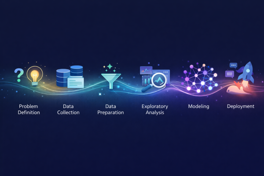
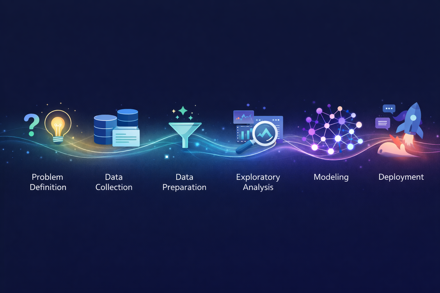
The Six Stages of the Data Science Workflow
While variations exist, most data science projects follow this fundamental structure:
1. Problem Definition → 2. Data Collection → 3. Data Preparation →
4. Exploratory Analysis → 5. Modeling → 6. Deployment & Communication
Each stage builds on the previous. Skip or rush any stage, and later stages suffer.
| Stage | Time Spent | Common Mistake |
| Problem Definition | 5-10% | Jumping straight to data |
| Data Collection | 10-20% | Assuming data exists and is accessible |
| Data Preparation | 40-60% | Underestimating cleaning effort |
| Exploratory Analysis | 10-15% | Skipping to modeling too fast |
| Modeling | 10-20% | Overcomplicating when simple works |
| Deployment & Communication | 10-15% | Building models that never get used |
Notice that data preparation consumes the largest share. This surprises newcomers but not practitioners. The joke in data science circles: “80% of the work is data cleaning, and the other 20% is complaining about data cleaning.”
Stage 1: Problem Definition
Goal: Translate a business question into a data science problem.
Why This Stage Is Critical
Every failed data science project can trace problems back to this stage. Either the wrong question was asked, the question was too vague, or the question couldn’t actually be answered with available data.
What Happens Here
Understand the business context:
- What decision needs to be made?
- Who will use the results?
- What action will be taken based on insights?
- What does success look like?
Frame the data science question:
- Is this prediction, classification, clustering, or optimization?
- What’s the target variable (what are we predicting)?
- What inputs might be relevant?
- What constraints exist (time, resources, privacy)?
Define success metrics:
- How will we measure if the solution works?
- What accuracy/performance is “good enough”?
- What’s the cost of errors (false positives vs. false negatives)?
Example: Problem Definition in Practice
Vague business question:
“We want to use AI to improve customer retention.”
Refined data science question:
“Predict which customers are likely to cancel their subscription in the next 30 days, with at least 70% precision, so the retention team can proactively reach out to at-risk customers with targeted offers.”
The refined version specifies:
- What to predict (cancellation within 30 days)
- Success metric (70% precision)
- How results will be used (retention team outreach)
- The action enabled (targeted offers)
Common Pitfalls
| Pitfall | Consequence |
| Skipping stakeholder alignment | Model solves wrong problem |
| Undefined success metrics | No way to evaluate if project succeeded |
| Ignoring constraints | Solution can’t be implemented |
| Scope creep | Project never finishes |
Stage 2: Data Collection
Goal: Gather the raw material needed to answer the question.
The Reality of Data Availability
Beginners assume data exists, is accessible, and is ready to use. Reality is messier:
- Data exists but in a system no one can access
- Data exists but sharing it violates privacy regulations
- Data exists but in incompatible formats across systems
- Data doesn’t exist yet and must be collected
- Data existed but was deleted or corrupted
What Happens Here
Identify data sources:
- Internal databases and systems
- Third-party data providers
- Public datasets
- APIs and web scraping (where legal/ethical)
- New data collection (surveys, sensors, experiments)
Assess data availability:
- Can we actually access this data?
- What permissions are needed?
- What privacy/compliance considerations apply?
- How current is the data?
Extract and consolidate:
- Pull data from various sources
- Combine into working datasets
- Document data lineage (where did each field come from?)
Data Source Examples
| Source Type | Examples | Considerations |
| Internal databases | CRM, transactions, product usage | May require IT support, access controls |
| Third-party data | Demographics, market data, weather | Cost, licensing, update frequency |
| Public datasets | Census, government statistics, research data | May be outdated, limited granularity |
| APIs | Social media, financial feeds, services | Rate limits, authentication, reliability |
| New collection | Surveys, IoT sensors, experiments | Time to collect, sample size, bias |
The Apple Health Example
When you export your Apple Health data for analysis, you’re performing data collection:
- Source: Apple Health app (aggregated from Apple Watch, iPhone, third-party apps)
- Format: XML file containing structured health records
- Scope: Heart rate, workouts, steps, sleep, and dozens of other metrics
- Access method: Manual export (Health app → Profile → Export)
The Apple Health Cycling Analyzer then processes this collected data through the remaining workflow stages – preparation, analysis, and insight delivery.
Common Pitfalls
| Pitfall | Consequence |
| Assuming data quality | Garbage in, garbage out |
| Ignoring data freshness | Models trained on outdated patterns |
| Overlooking legal constraints | Compliance violations, project shutdown |
| Incomplete documentation | Can’t reproduce or debug later |
Stage 3: Data Preparation
Goal: Transform raw data into a clean, analysis-ready format.
Why This Takes So Long
Raw data is messy. Always. Even data that looks clean contains surprises:
- Missing values scattered throughout
- Inconsistent formats (“USA”, “U.S.A.”, “United States”, “US”)
- Duplicate records that aren’t obvious duplicates
- Outliers that are errors vs. outliers that are genuine
- Columns that mean different things in different time periods
- Encoded values no one documented
What Happens Here
Data cleaning:
| Task | Example |
| Handle missing values | Fill with median, remove rows, flag as unknown |
| Fix inconsistencies | Standardize “USA” variations to single format |
| Remove duplicates | Identify and eliminate redundant records |
| Correct errors | Fix obvious typos, impossible values |
| Handle outliers | Investigate, cap, remove, or keep with justification |
Data transformation:
| Task | Example |
| Type conversion | Convert strings to dates, numbers to categories |
| Normalization | Scale features to comparable ranges (0-1) |
| Encoding | Convert categories to numbers for algorithms |
| Aggregation | Summarize transactions to customer-level metrics |
| Feature engineering | Create new variables from existing ones |
Data integration:
| Task | Example |
| Join datasets | Combine customer data with transaction history |
| Resolve conflicts | When sources disagree, determine truth |
| Align timestamps | Ensure time-based data uses consistent zones |
| Match entities | Link records referring to same customer across systems |
Feature Engineering: Creating Signal
Feature engineering transforms raw data into variables that help models learn patterns. This is often where domain expertise creates the most value.
Example: Cycling performance analysis
Raw data:
- Heart rate readings every second
- GPS coordinates every second
- Elevation points
Engineered features:
- Average heart rate (aggregation)
- Heart rate drift (change over time)
- Efficiency factor (speed ÷ heart rate)
- VAM (vertical ascent meters per hour)
- Time in heart rate zones (bucketing)
These engineered features capture performance patterns that raw measurements don’t directly reveal.
The 80% Rule
Data preparation typically consumes 60-80% of project time. Organizations that build robust data infrastructure reduce this burden; those with fragmented systems spend even more time here.
The investment pays off: Clean, well-prepared data enables everything downstream. Rushing this stage dooms the project.
Common Pitfalls
| Pitfall | Consequence |
| Insufficient cleaning | Models learn noise, not signal |
| Data leakage | Future information contaminates training data |
| Ignoring domain context | Feature engineering misses key insights |
| No documentation | Can’t reproduce preprocessing steps |
Stage 4: Exploratory Data Analysis (EDA)
Goal: Understand the data deeply before modeling.
Why Explore Before Modeling
Jumping straight to machine learning algorithms is tempting. Resist the temptation.
EDA reveals:
- What patterns exist (or don’t)
- Whether your hypothesis makes sense
- What problems remain in the data
- Which features seem promising
- What modeling approach might work
What Happens Here
Univariate analysis (one variable at a time):
| Analysis | Purpose |
| Summary statistics | Mean, median, min, max, standard deviation |
| Distribution plots | Histograms, density curves – what’s the shape? |
| Missing value assessment | How much is missing? Is it random? |
| Outlier identification | What values are extreme? Why? |
Bivariate analysis (relationships between variables):
| Analysis | Purpose |
| Correlation matrices | Which variables move together? |
| Scatter plots | Visualize relationships between pairs |
| Cross-tabulations | How do categories relate? |
| Group comparisons | How do metrics differ across segments? |
Multivariate analysis (complex patterns):
| Analysis | Purpose |
| Dimensionality reduction | Visualize high-dimensional data (PCA, t-SNE) |
| Clustering exploration | Do natural groups exist? |
| Interaction effects | Do variable relationships change in different contexts? |
Visualization: The EDA Superpower
Humans process visual information remarkably well. Charts reveal patterns that statistics miss:
- A histogram shows whether data is normally distributed or skewed
- A scatter plot exposes non-linear relationships
- A time series chart reveals seasonality and trends
- A box plot comparison shows group differences immediately
Example: EDA for Cycling Data
Before building a fitness model, explore the data:
Questions to answer:
- How are heart rate values distributed across rides?
- Does efficiency factor correlate with ride duration?
- Are there seasonal patterns in performance?
- Do morning rides show different metrics than evening rides?
- Which features vary together?
Discoveries that shape modeling:
- “Heart rate drift is strongly correlated with temperature – need to account for weather”
- “Weekend rides are systematically longer – should segment analysis by ride type”
- “Some GPS data has clear errors – need to filter impossible speeds”
The Insight Checkpoint
EDA often answers the business question before any modeling begins.
Sometimes exploration reveals: “Customers who do X are 5x more likely to churn.” The insight is immediately actionable. No model needed.
Other times exploration reveals: “There’s no discernible pattern here. The data doesn’t contain the signal we hoped for.” Better to discover this before investing in complex modeling.
Common Pitfalls
| Pitfall | Consequence |
| Skipping EDA entirely | Miss obvious issues and insights |
| Analysis paralysis | Endless exploration, never progressing |
| Ignoring domain context | Misinterpreting patterns |
| Not documenting findings | Insights lost, work repeated |
Stage 5: Modeling
Goal: Build algorithms that capture patterns and make predictions.
The Stage Everyone Focuses On
This is the “sexy” part of data science – the machine learning, the algorithms, the AI. Ironically, it’s often the smallest time investment when the earlier stages are done properly.
What Happens Here
Select modeling approach:
| Problem Type | Algorithm Examples |
| Classification (predict category) | Logistic regression, random forest, neural networks |
| Regression (predict number) | Linear regression, gradient boosting, neural networks |
| Clustering (find groups) | K-means, hierarchical clustering, DBSCAN |
| Anomaly detection | Isolation forest, autoencoders |
| Recommendation | Collaborative filtering, matrix factorization |
Train-test split:
Never evaluate a model on the data it learned from. Split data into:
- Training set (70-80%): Model learns patterns here
- Validation set (10-15%): Tune model parameters here
- Test set (10-15%): Final evaluation, touched once
Model training:
The algorithm processes training data, adjusting internal parameters to minimize prediction errors. What this looks like depends on the algorithm – linear regression finds optimal coefficients; neural networks adjust millions of weights through backpropagation.
Hyperparameter tuning:
Algorithms have settings (hyperparameters) that affect learning. Examples:
- Learning rate (how fast to adjust)
- Tree depth (how complex can patterns be)
- Regularization strength (how much to prevent overfitting)
Finding optimal hyperparameters involves systematic experimentation using the validation set.
Model evaluation:
Assess model quality using held-out test data:
| Metric Type | Examples | When to Use |
| Classification | Accuracy, precision, recall, F1, AUC | Predicting categories |
| Regression | MAE, RMSE, R² | Predicting numbers |
| Ranking | NDCG, MAP | Recommendations, search |
The Simplicity Principle
Start simple. Always.
Why simple models first:
- Easier to understand and debug
- Faster to train and iterate
- Often perform surprisingly well
- Establish baseline for comparison
Progression:
- Simple baseline (mean prediction, basic rules)
- Simple model (logistic regression, decision tree)
- More complex only if simple underperforms
Many production systems use “boring” models – logistic regression, gradient boosting – because they work, are interpretable, and are maintainable.
Overfitting: The Central Challenge
Overfitting: Model performs well on training data but poorly on new data. It memorized examples rather than learning generalizable patterns.
Signs of overfitting:
- Large gap between training and validation performance
- Model is very complex relative to data size
- Performance degrades significantly on test set
Prevention strategies:
- More training data
- Simpler models
- Regularization techniques
- Cross-validation
- Early stopping
Common Pitfalls
| Pitfall | Consequence |
| Overcomplicating early | Wasted time, harder debugging |
| Ignoring baseline comparison | Don’t know if model adds value |
| Overfitting | Model fails on real-world data |
| Data leakage | Artificially inflated performance |
| Wrong evaluation metric | Optimizing for wrong goal |
Stage 6: Deployment and Communication
Goal: Put the model into use and communicate results to stakeholders.
The Valley of Death
Most data science projects die here. A model works beautifully in a notebook but never makes it to production. Insights are generated but never communicated effectively.
Deployment: Making Models Operational
Deployment options:
| Approach | Description | Use Case |
| Batch prediction | Run model periodically on new data | Daily risk scores, weekly forecasts |
| Real-time API | Model serves predictions on request | Fraud detection, recommendations |
| Embedded | Model integrated into application | Mobile apps, edge devices |
| Dashboard | Visualizations updated with model outputs | Monitoring, exploration |
Deployment considerations:
| Factor | Questions |
| Infrastructure | Where will the model run? What resources needed? |
| Latency | How fast must predictions be returned? |
| Scale | How many predictions per second? |
| Monitoring | How to detect model degradation? |
| Updates | How to retrain and redeploy? |
MLOps: The emerging discipline of operationalizing machine learning – version control for models, automated retraining pipelines, monitoring systems, and deployment automation.
Communication: Making Results Actionable
Technical excellence means nothing if stakeholders don’t understand or trust the results.
Know your audience:
| Audience | What They Need |
| Executives | Bottom line impact, strategic implications, high-level summary |
| Business stakeholders | Actionable insights, recommendations, how to use results |
| Technical peers | Methodology, validation, reproducibility |
| End users | Simple interface, clear outputs, reliability |
Effective communication elements:
| Element | Purpose |
| Executive summary | Key findings in 30 seconds |
| Visual results | Charts that tell the story |
| Business impact | Translate accuracy to dollars, customers, outcomes |
| Limitations | What the model can’t do, where it might fail |
| Recommendations | What actions to take based on findings |
The Feedback Loop
Deployment isn’t the end – it’s the beginning of a cycle:
Deploy → Monitor → Gather feedback → Identify issues →
Improve → Redeploy → Monitor → …
Models degrade over time. The world changes; patterns shift; what worked six months ago may fail today. Continuous monitoring and periodic retraining are essential.
Example: End-to-End Apple Health Analysis
The Apple Health Cycling Analyzer implements this complete workflow:
| Stage | Implementation |
| Problem definition | “Help cyclists understand performance trends from Apple Watch data” |
| Data collection | User exports Apple Health data; analyzer receives XML |
| Data preparation | Parse XML, extract cycling workouts, calculate derived metrics |
| Exploratory analysis | Compute efficiency factors, HR drift, trends across rides |
| Modeling | Apply performance assessment logic, compare to rolling baselines |
| Deployment & communication | Browser-based tool delivers insights visually with coach rationale |
The entire workflow happens in your browser – demonstrating that sophisticated data science doesn’t always require massive infrastructure.
Common Pitfalls
| Pitfall | Consequence |
| No deployment plan | Model never used |
| Poor communication | Stakeholders don’t act on insights |
| No monitoring | Model degrades unnoticed |
| Ignoring user needs | Solution doesn’t fit workflow |
The Iterative Reality
The linear workflow presented here is conceptual. Real projects are messier:
Reality:
Problem Definition → Data Collection → [realize data doesn’t exist] →
Back to Problem Definition → Data Collection → Data Preparation →
[discover quality issues] → Back to Collection → Preparation → EDA →
[find new questions] → Adjust Problem → Preparation → EDA → Modeling →
[poor results] → Back to EDA → Feature Engineering → Modeling →
[acceptable results] → Deployment → [feedback] → Back to Modeling…
Iteration is normal. The workflow is a framework for thinking, not a rigid prescription. Experienced practitioners expect to cycle through stages multiple times.
Workflow Automation: Accelerating the Process
Mature organizations automate repetitive workflow components:
| Automation | Benefit |
| Data pipelines | Automatically collect and prepare data on schedule |
| Feature stores | Reusable feature engineering, no reinventing the wheel |
| AutoML | Automated model selection and hyperparameter tuning |
| CI/CD for models | Automated testing and deployment |
| Monitoring dashboards | Automatic alerts when model performance degrades |
Automation doesn’t eliminate the workflow – it accelerates specific stages, freeing data scientists for high-value work: problem framing, feature engineering, and communication.
From Process to Practice
Understanding the data science workflow reveals what happens behind every AI headline, every recommendation engine, every predictive system you encounter.
It also reveals why some projects succeed and others fail. The difference isn’t usually algorithmic brilliance – it’s disciplined execution across all six stages.
Whether you’re analyzing your own fitness data with the Apple Health Cycling Analyzer or building enterprise machine learning systems, the workflow remains consistent. The scale changes; the fundamentals don’t.
Master the process, and the results follow.
Leave a Reply