Here’s a question worth sitting with for a moment.
A cycling club has ten members. Nine of them earn €35,000 per year. One of them – a tech entrepreneur who also rides – earns €2,000,000 per year. What’s the average income of the club?
The mean average is €213,500. Which tells you almost nothing useful about the financial reality of the nine people who actually make up the character of that club. It’s technically correct and practically misleading – a number that exists nowhere in the actual data.
This is the central problem with summary statistics: they compress a rich, complex distribution of values into a single number, and that compression always loses information. Sometimes it loses critical information. The question is whether you know enough to recognize when the summary is telling you something real and when it’s leading you astray.
Mean, median, and distribution are the three foundational tools for answering that question. They’re also three of the most misused concepts in everyday data analysis – not because they’re complicated, but because they’re rarely explained in terms of what they actually reveal and when each one breaks down.
This article fixes that.
What a Distribution Actually Is
Before mean or median make sense, you need a clear mental model of what they’re summarizing.
A distribution is simply the full picture of how values are spread across a dataset. Not a single number – the entire landscape of values, from the smallest to the largest, including how frequently each range of values appears.
Think of it this way: if you recorded the duration of every cycling ride a person completed over a year, you’d have a collection of numbers. Some rides are short – 20 minutes. Some are medium – 60 to 90 minutes. Some are long – 3 hours plus. A few are outliers in both directions.
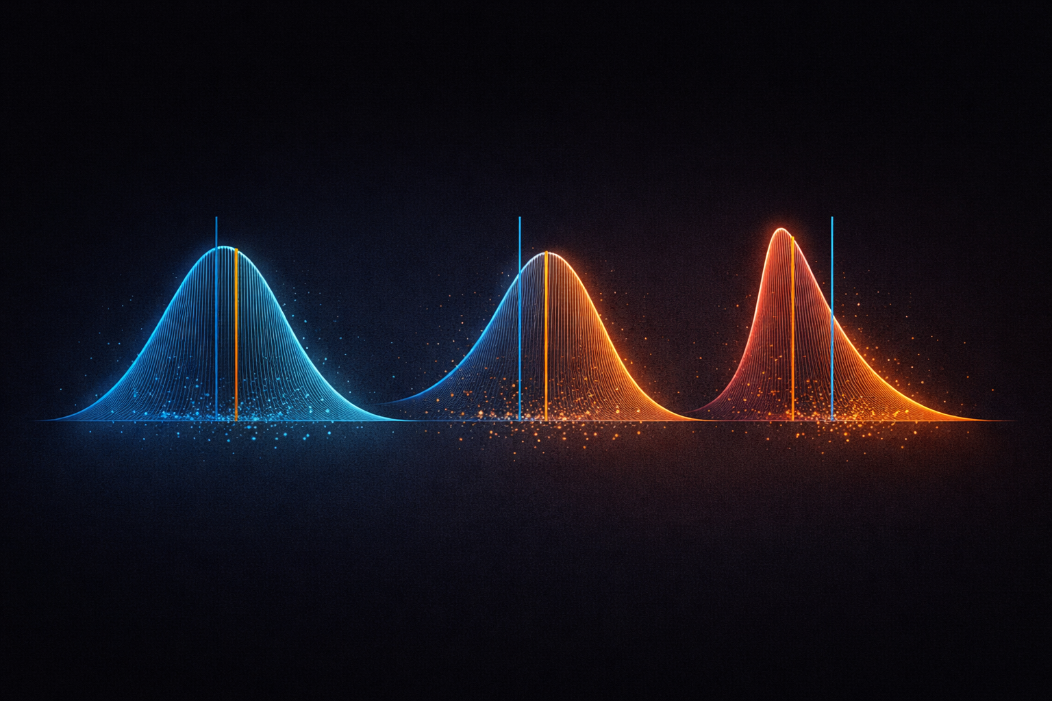
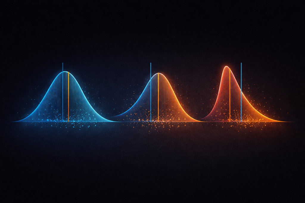
If you plotted all of these values on a chart – putting ride duration on the horizontal axis and frequency on the vertical axis – the shape that emerges is the distribution. It might look like a smooth hill, peaked in the middle. It might be lopsided, with most values clustered at the lower end and a long tail stretching right. It might have two humps, suggesting two distinct types of rides mixed together.
That shape is the distribution. And it contains far more information than any single summary number can capture.
The most famous distribution shape is the normal distribution – the classic bell curve. Symmetrical, peaked in the middle, tapering equally on both sides. Many natural phenomena approximate this shape: height measurements in a large population, measurement errors, certain biological variables.
But real-world data is often not normally distributed. It’s skewed, multimodal, or heavy-tailed. And understanding which shape you’re dealing with is what determines whether the mean is a useful summary – or a dangerous one.
The Mean: Powerful, But Fragile
The mean is what most people mean when they say “average.” Add up all the values, divide by how many there are.
Mean = Sum of all values ÷ Number of values
For a symmetric, well-behaved distribution – one that looks roughly like a bell curve – the mean is an excellent summary. It sits at the center of the distribution, balances all values equally, and gives you a genuinely representative single number.
The problem is that the mean is sensitive to extreme values. Every value in the dataset pulls the mean toward itself, proportionally to how far it sits from the center. One very large value can drag the mean far from where most of the data actually lives.
This is why the income example at the start of this article produces a misleading result. The one extreme earner doesn’t just add one data point – they pull the entire mean upward by an amount that bears no resemblance to the typical member’s reality.
In statistics, values that sit far outside the main body of data are called outliers. The mean has no resistance to them. A single outlier in a small dataset can shift the mean dramatically – making it a poor representative of the typical value.
When the mean works well:
- Symmetric distributions without extreme outliers
- Large datasets where individual extremes have less leverage
- When you genuinely care about the total sum (average spend per customer, for example, directly scales to total revenue)
When the mean misleads:
- Skewed distributions (income, house prices, ride power during sprints)
- Small datasets with one or more extreme values
- When you care about the typical experience, not the mathematical average
The Median: Robust, But Limited
The median is the middle value when all values are sorted from smallest to largest. Exactly half the values sit below it, exactly half above it.
For an odd number of values: median = the middle value
For an even number of values: median = mean of the two middle values
Using the cycling club example: sort the ten incomes from lowest to highest. The median is the average of the 5th and 6th values – both around €35,000. The median is €35,000, which accurately represents what nine of the ten members actually earn.
The median’s key property is robustness to outliers. Because it’s determined purely by position – by where the middle is – extreme values don’t pull it. You could replace the entrepreneur’s €2,000,000 income with €20,000,000 and the median wouldn’t move at all. The middle is still the middle.
This makes the median a much more reliable summary for skewed data. House prices, income distributions, training load data, response times in software systems – anywhere the distribution has a long tail, the median tells the more honest story.
When the median works well:
- Skewed distributions where outliers are present
- When you want to know the typical or central experience
- When the distribution has heavy tails
When the median has limitations:
- It ignores the actual values of data points – only their rank matters
- It doesn’t scale to totals the way the mean does
- In multimodal distributions (more than one peak), even the median can miss the real structure
Mean vs. Median: Reading the Gap Between Them
Here’s a powerful practical insight: the relationship between the mean and median tells you about the shape of your distribution.
When the mean and median are close together, the distribution is approximately symmetric. Values are balanced around the center. The mean and median are both giving you similar, reliable information.
When the mean is higher than the median, the distribution is right-skewed – there are some unusually high values pulling the mean upward. Most values sit below the mean. Income is the classic example. House prices. Response times in computer systems. Training power output data that includes sprint efforts.
When the mean is lower than the median, the distribution is left-skewed – there are some unusually low values dragging the mean down. This is less common but does occur – test scores with a floor effect, for example.
| Mean vs. Median | Distribution Shape | What it means |
| Mean ≈ Median | Symmetric | Both are reliable summaries |
| Mean > Median | Right-skewed | High outliers present – median more representative |
| Mean < Median | Left-skewed | Low outliers present – median more representative |
In practice, checking whether the mean and median are similar is one of the fastest diagnostic tools in exploratory data analysis. A large gap between them is an immediate signal to look at the full distribution rather than trusting either number in isolation.
Distribution Shape: The Four Patterns Worth Knowing
Beyond symmetric vs. skewed, four distribution shapes appear repeatedly in real-world data and each tells a different story.
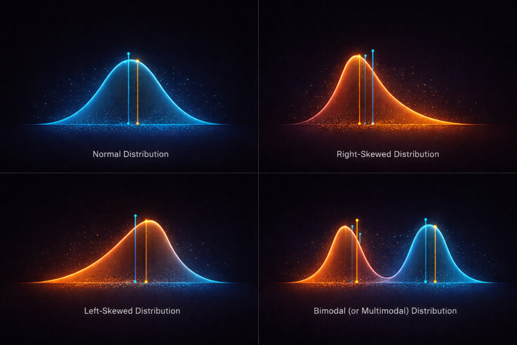
The Normal Distribution (Bell Curve)
Symmetric, single-peaked, tails that taper gradually. Mean and median coincide at the center.
Many naturally occurring measurements approximate this shape in large samples – human height, IQ scores, measurement errors. When data is normally distributed, the mean is an excellent summary, and a huge body of statistical methods apply cleanly.
In practice, truly normal distributions are rarer than textbooks suggest. Always verify rather than assume.
Right-Skewed Distribution
A tall peak on the left with a long tail extending to the right. Most values are relatively low, but a few extreme high values pull the mean rightward.
Extremely common in real-world data: income, wealth, house prices, city populations, cycling power output distributions, response times, insurance claims. Whenever a variable has a natural floor of zero but no ceiling, right-skew is the expected shape.
For right-skewed data: report the median, not the mean, when describing the typical value.
Left-Skewed Distribution
The mirror image – peak on the right, tail extending left. Less common, but appears in data with a natural ceiling: test scores where most people score well but a few score very low, age at death in high-income countries, product ratings dominated by high scores.
Bimodal (or Multimodal) Distribution
Two distinct peaks, suggesting the data contains two different sub-populations mixed together.
This is a pattern that both mean and median can completely obscure. If your data has two peaks – say, one cluster of rides around 45 minutes and another around 120 minutes – the mean might sit around 80 minutes, a value that barely appears in the actual data at all. The median would land somewhere in the middle too, equally unrepresentative.
A bimodal distribution is often a signal that you should split your data and analyze the two groups separately. The summary statistics are hiding more than they’re revealing.
Spread: The Dimension That Summaries Miss Entirely
Here’s something critical that mean and median both fail to capture: how spread out the values are.
Two datasets can have identical means and medians but look completely different:
Dataset A: 48, 49, 50, 51, 52 – Mean: 50, Median: 50
Dataset B: 10, 25, 50, 75, 90 – Mean: 50, Median: 50
Same center. Completely different spread. Dataset A is tightly clustered. Dataset B is wildly dispersed. Any decision based only on the mean or median treats these identically – which would be a serious mistake in most real contexts.
Spread is typically measured with two statistics:
Range: The distance from the smallest to the largest value. Simple and intuitive, but sensitive to outliers – a single extreme value makes the range look huge.
Standard deviation: The average distance of each value from the mean. The most widely used measure of spread. A small standard deviation means values cluster tightly around the mean. A large one means they’re widely dispersed.
In a normal distribution, the standard deviation has a specific, powerful property: approximately 68% of values fall within one standard deviation of the mean, 95% within two, and 99.7% within three. This is the 68-95-99.7 rule, and it gives the standard deviation immediate interpretive meaning for bell-shaped data.
But – and this is important – standard deviation is calculated using the mean. It inherits the mean’s sensitivity to outliers. For skewed data, a more robust measure of spread is the interquartile range (IQR): the distance between the 25th percentile and the 75th percentile, covering the middle 50% of values.
A Real-World Example: Cycling Performance Data
Let’s make all of this concrete.
Imagine you’re analyzing power output data from 200 cycling rides. The mean average power is 198 watts. The median is 172 watts. Already, that gap tells you something: the distribution is right-skewed. There are some high-power efforts pulling the mean upward.
Plot the histogram and the picture becomes clear: most rides cluster between 140 and 190 watts – steady aerobic sessions. But there’s a distinct tail of higher-power rides stretching toward 320 watts. These are interval sessions and race efforts. Two meaningfully different types of ride sitting in the same dataset.
This is a bimodal distribution hiding inside a right-skew. The mean of 198 watts represents neither the typical endurance ride nor the typical hard effort – it’s an average of two populations that probably deserve separate analysis.
What the data is actually telling you: split the dataset by ride type before summarizing. The mean and median of each group separately will be far more informative than any single summary of the combined dataset.
This is exactly the kind of insight that looking at the full distribution – not just the summary statistics – reveals.
The Practical Checklist
When you encounter any numerical variable in a dataset, work through this sequence:
1. Calculate both the mean and the median.
If they’re close, the distribution is likely symmetric and the mean is reliable. If there’s a meaningful gap, the distribution is skewed and the median is the more honest summary.
2. Look at the full distribution – plot a histogram.
A single number never tells the whole story. The shape tells you whether you’re dealing with one population or two, whether there are outliers, whether the data is bounded or unbounded.
3. Check the spread.
Standard deviation for roughly symmetric data. Interquartile range for skewed data. A summary without spread is incomplete – it tells you where the center is but nothing about how reliable that center is as a representative value.
4. Ask: does this summary make sense given what generated the data?
Income data will always be right-skewed – that’s structural, not a data quality issue. Test scores may be left-skewed if most participants are well-prepared. Measurement errors should be approximately normal. Match your expectations to the data’s generating process.
Why This Matters Beyond Statistics
The reason mean, median, and distribution matter isn’t academic. It’s because poorly understood summary statistics lead to bad decisions – in business, in research, in personal training, in public policy.
The hospital that reports “average wait time: 18 minutes” while hiding a heavily right-skewed distribution where 20% of patients wait over two hours.
The training plan built around “average weekly power” that ignores the bimodal reality of easy days and hard days requiring completely different recovery protocols.
The salary negotiation based on the mean salary in a role, when the median is €15,000 lower and the mean is inflated by a handful of executives.
Numbers without distribution context are not neutral summaries. They’re choices – sometimes honest, sometimes not. Understanding the difference between mean and median, and insisting on seeing the full shape of data before trusting any single number, is one of the most practically valuable analytical skills you can develop.
The average is not the data. The data is the data. Everything else is compression.
Summary
| Concept | What It Measures | When to Use It | Key Weakness |
| Mean | Mathematical center | Symmetric distributions, no outliers | Sensitive to extreme values |
| Median | Middle value by rank | Skewed data, outliers present | Ignores actual value magnitudes |
| Standard deviation | Spread around the mean | Symmetric distributions | Sensitive to outliers |
| IQR | Spread of middle 50% | Skewed distributions | Less intuitive than std dev |
| Distribution shape | Full picture of values | Always – before any summary | Requires visualization |
Leave a Reply