You’re about to see how tiny everyday objects compare to planets, stars, and entire galaxies—and that perspective will change how you think about distance and scale. You’ll discover clear, visual comparisons that show the true sizes of objects from atoms to the observable universe, so you can grasp how enormous cosmic structures are and how small familiar things really are.

Follow along as visuals and interactive tools break complex scales into simple, compelling comparisons—from celestial bodies and other solar systems to galactic and intergalactic distances—so you can picture each jump in size. Expect practical tips and visualization methods that make abstract numbers feel immediate and intuitive, helping you relate cosmic scale back to everyday life.
The Scale of the Universe: From Atom to Cosmos

You will move from the tiniest building blocks of matter to the size of worlds and beyond, spotting how familiar objects and planets fit into the same ladder of scale. Expect clear numeric comparisons and visual cues that make those leaps feel concrete.
Atomic Scale to Everyday Objects
At the atomic level, you deal with distances measured in picometers (10^-12 m) and smaller. A hydrogen atom’s radius is about 25 pm; atomic nuclei collapse to femtometer scales (~10^-15 m). Electrons occupy cloud-like orbitals rather than neat orbits, so size often means the region where you’re likely to find an electron.
Everyday materials assemble from these atoms. A single grain of table salt contains roughly 10^19 sodium chloride units. If you magnify a human hair (≈100 µm) to the width of a city street, an atom would still be smaller than a speck of dust by many orders of magnitude. Visual tools that span orders of magnitude help you sense these differences without needing specialized equipment.
Earth Compared to an Apple
You can use an apple to visualize Earth’s relative size in a simple scale model. If the apple is 8 cm in diameter and represents Earth (12,742 km actual diameter), then the Moon would be a 2.1 cm sphere placed about 23 meters away. The Sun in this model would be a roughly 8.8 m sphere located about 2.5 kilometers from the apple.
This scaling clarifies distance as much as size: the Moon is close relative to interplanetary distances, yet still far on a human scale. Using such concrete comparisons helps you intuit how planetary separations dwarf object diameters, and why space missions require vast travel times and precise navigation.
Planetary Scale and Beyond
Planets span from Mercury’s 4,880 km to Jupiter’s 139,820 km in diameter; Jupiter’s volume could contain over 1,300 Earths. You should note mass and composition matter: rocky planets concentrate mass at smaller radii, while gas giants extend low-density envelopes far from their cores. Surface gravity differences change how you’d move—Mars (0.38 g) would make you lighter; Jupiter’s cloud tops (if you could stand) would feel stronger gravity than Earth.
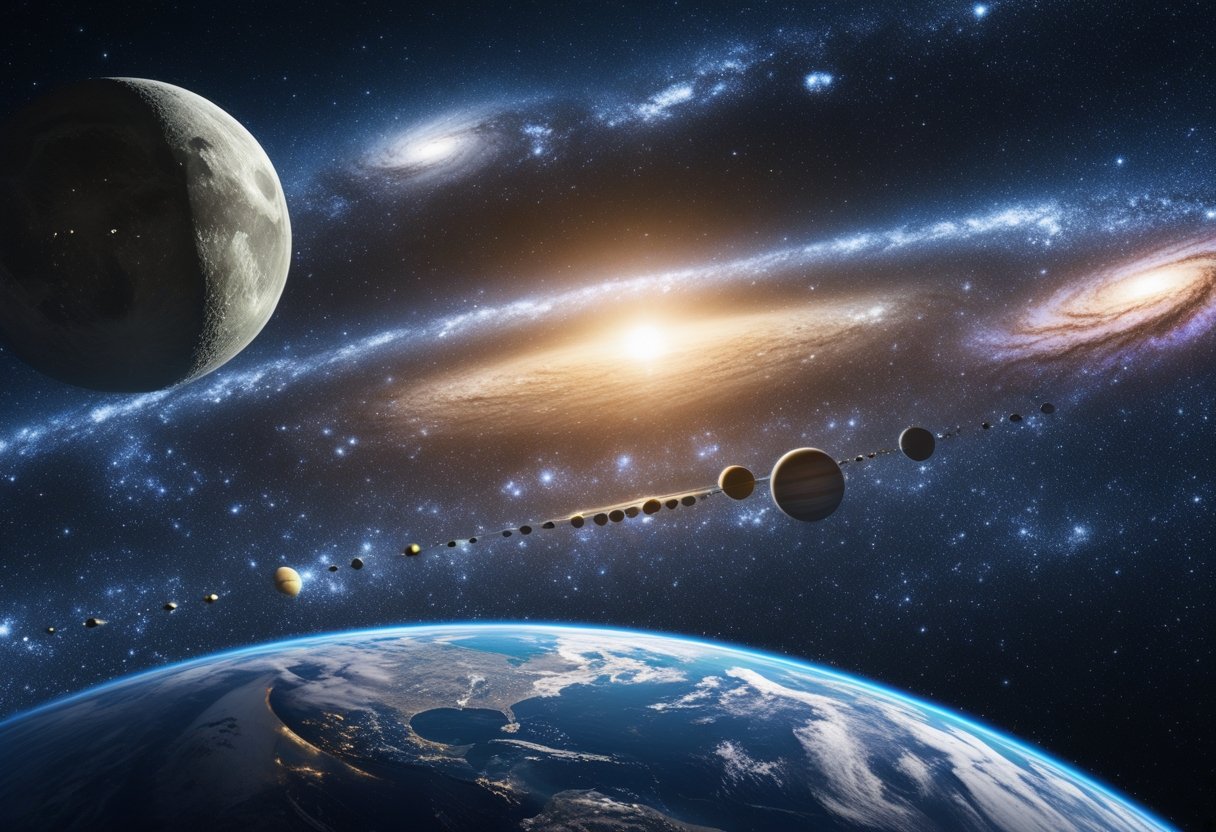
Beyond planets lie stars, stellar clusters, galaxies, and superclusters. The Milky Way measures about 100,000 light-years across; the observable universe stretches to roughly 46.1 billion light-years in radius. For visual scaling, use logarithmic rulers or interactive tools that map objects by orders of magnitude so you can trace how atoms build to apples, apples map to planets, and planets fit inside the cosmic web.
Relevant interactive visualizations include the Scale of the Universe project and exhibits like the American Museum of Natural History’s Scales of the Universe, which let you move smoothly from 10^-18 meters up to 10^26 meters for immediate perspective.
Visual Size Comparisons of Celestial Bodies
http://www.slimy.com/~steuard/teaching/solarsystem/
You will see how planetary diameters, stellar radii, and small-body dimensions relate by direct numbers and side-by-side proportions. Visual comparisons reveal unexpected scale differences—from Moon-sized worlds to stars hundreds of times larger than the Sun.
Planets, Moons, and Dwarf Planets
You can compare worlds by diameter and volume to grasp how much larger one is than another. Earth’s diameter is about 12,742 km; Mars measures ~6,779 km, so Mars is roughly 53% of Earth’s diameter and about 15% of Earth’s volume. Jupiter’s diameter is ~139,820 km, making it nearly 11 times wider than Earth and able to contain over 1,300 Earths by volume.
Use simple ratios to visualize:
- Earth : Moon ≈ 3.7 : 1 in diameter.
- Earth : Pluto ≈ 5.4 : 1 in diameter.
A quick table helps:
| Body | Diameter (km) | Relative to Earth (diameter) |
|---|---|---|
| Earth | 12,742 | 1.00× |
| Moon | 3,474 | 0.27× |
| Mars | 6,779 | 0.53× |
| Pluto | 2,370 | 0.19× |
| Jupiter | 139,820 | 10.97× |
You should note that dwarf planets and large moons can be similar in size; Pluto and Earth’s Moon are comparable, but Pluto’s lower mass and composition make it distinct. Visual tools and interactive apps let you place these bodies side-by-side to see exact scale differences.
Comparing Stars of Different Types
You will notice stars vary far more than planets do. The Sun’s diameter (~1.39 million km) sets a familiar baseline, but red dwarfs can be as small as ~0.1 solar radii while supergiants like Betelgeuse can exceed 800 solar radii. That range means a supergiant’s radius can be hundreds to thousands of times that of the Sun.
Key comparisons by type:
- Red dwarf (e.g., Proxima Centauri): ~0.14 R☉.
- Sun-like (G-type): 1.0 R☉.
- Red giant: 10–100 R☉.
- Red supergiant (e.g., Betelgeuse): hundreds to >1,000 R☉.
Because volume scales with the cube of radius, a star twice the Sun’s radius is eight times the Sun’s volume. You should rely on visualizations that scale radii logarithmically to prevent small stars from vanishing when shown with supergiants. For realistic comparisons, pair radius values with luminosity and temperature numbers so you see how size, brightness, and color interrelate.
The Trappist-1 System
You can inspect Trappist-1 as a compact, tightly packed planetary system useful for scale comparisons. Trappist-1 is a red dwarf roughly 0.12–0.13 times the Sun’s radius. Its seven known planets range from about Mars-size up to Earth-size, so visually they cluster close together near a tiny, dim star.
Important visual points:
- Star radius ~0.12 R☉, so it appears much smaller than the Sun in any scale diagram.
- Several planets fall between 0.7–1.1 Earth radii, making them easy to line up with Earth-Moon and Earth-Mars comparisons.
- Orbital spacing is compact: many orbits fit within the distance of Mercury’s orbit, so diagrams that show both size and orbital scale better convey the system’s tight configuration.
Interactive projects that include Trappist-1 let you compare planet diameters directly to Earth and demonstrate how habitable-zone distances shift inward around a red dwarf.
Asteroids and Other Space Objects
You will find small bodies span from meters to thousands of kilometers and require different visualization scales. Asteroids like Ceres (≈940 km) compare to dwarf planets, while typical asteroids in the main belt measure tens to hundreds of kilometers. Comets and small irregular moons can be mere kilometers across.
Helpful classification for visuals:
- Kilometer-scale: many asteroids, small moons.
- 100–1,000 km: large asteroids and dwarf planets (Ceres, Pluto-class).
- >1,000 km: planets and large moons.
When you visualize, use separate panels or inset scales so tiny objects remain visible without misrepresenting large planets or stars. Interactive size-comparison tools let you overlay how many small objects fit inside larger ones, clarifying both count and proportion. For practical comparisons and demos, try WebGL or browser-based apps that show planets, moons, and asteroids side-by-side.
Comparing Our Solar System to Others
You’ll see how planet sizes in our system stack up against each other and how those arrangements differ from other planetary systems discovered around other stars. Expect clear size contrasts and examples that highlight why some systems, like TRAPPIST‑1, challenge what you think of as a “typical” planetary layout.
Relative Sizes of Solar System Planets
You can compare planets by diameter and composition. Jupiter’s diameter (~139,822 km) dominates; Saturn (~116,464 km) follows, then Uranus (~50,724 km) and Neptune (~49,244 km). Terrestrial planets—Earth (~12,742 km), Venus (~12,104 km), Mars (~6,779 km), Mercury (~4,880 km)—are much smaller and rockier.
Key points to note:
- Gas giants hold most of the system’s mass and volume.
- Terrestrial worlds cluster below ~13,000 km diameter.
- Density contrasts matter: Earth’s higher density gives it more mass than a similarly sized icy body.
Quick visual aid:
- Jupiter ≈ 11× Earth’s diameter.
- Neptune ≈ 4× Earth’s diameter.
- Mercury ≈ 0.38× Earth’s diameter.
These proportions explain why scale models often show planets much larger relative to distances than they truly are. If you build a tabletop model that gets planetary sizes right, you’ll quickly lose realistic interplanetary spacing.
Solar System vs. Exoplanetary Systems
Many exoplanetary systems defy your Solar System’s pattern. Systems like TRAPPIST‑1 host several Earth-sized planets packed within orbits smaller than Mercury’s. TRAPPIST‑1’s seven known planets range roughly from Mars‑size to Earth-size and orbit within 0.06 AU, a compactness far tighter than your system.
Differences you should notice:
- Compact systems: multiple rocky planets inside a single Mercury-like orbit.
- Hot Jupiters: gas giants that orbit extremely close to their stars, unlike Jupiter.
- Mass and spacing variations: some systems have many super‑Earths where our system has none.
Compare tools and visualizers demonstrate these contrasts clearly; for example, interactive models let you overlay your Solar System with a compact system to see how planetary radii and orbital scales diverge.
Galactic and Intergalactic Scale
You’ll see how individual galaxies vary from dwarfs to giants, and how immense the distances are between them compared with their sizes. Expect concrete numbers for galaxy diameters, mass ranges, and typical intergalactic separations.
How Galaxies Compare in Size
Galaxies range from tiny dwarf systems a few hundred to a few thousand light-years across to giants over 300,000 light-years in diameter.
For example, a typical dwarf galaxy like the Sculptor Dwarf spans ~3,000 ly, while the Milky Way measures about 100,000–120,000 light-years across. The Andromeda Galaxy reaches roughly 220,000 ly, and giant ellipticals such as IC 1101 can extend beyond 300,000–600,000 ly.
Key physical properties:
- Diameter: hundreds to hundreds of thousands of light-years.
- Stellar mass: ~10^7 to >10^12 solar masses.
- Contents: stars, gas, dust, dark matter halos, and central black holes.
You can compare visually by imagining the Milky Way as a city-sized disk and giant ellipticals as sprawling metropolitan regions. Galaxies also differ in shape—spirals, ellipticals, irregulars—and that affects how stars and gas distribute across those distances.
Distances and Sizes Between Galaxies
Typical distances between neighboring large galaxies in groups are on the order of hundreds of thousands to a few million light-years.
For example, the Milky Way and Andromeda sit about 2.5 million light-years apart within the Local Group.
Scales to remember:
- Within a galaxy group: ~0.1–3 million ly separations.
- Between clusters: tens to hundreds of millions of light-years.
- Across superclusters and filaments: hundreds of millions to billions of light-years.
Intergalactic space contains sparse gas and dark matter; galaxy sizes are tiny compared to these separations.
That means when you look at a galaxy, its physical diameter is often a small fraction (1% or less) of the distance to its nearest large neighbor. This vast spacing shapes galaxy interactions, mergers, and the large-scale web of filaments that connect clusters and superclusters.
Visualizing Size: Tools and Techniques
You can explore relative scales using interactive apps and high-quality animations that map exact diameters, distances, and scale ratios. These tools turn numbers into visuals so you can see how many Earths fit inside the Sun or how a red dwarf compares to a blue giant.
Interactive Digital Comparisons
You’ll get immediate, hands-on context with interactive size comparison websites that let you drag, zoom, and layer objects to compare diameters and fit counts. Use visual calculators that show exact proportions and how many smaller objects fit inside larger ones — for example, a globe-based tool that computes how many Earths equal a gas giant by diameter and volume.
Look for features that matter: precise numeric readouts, customizable object lists (planets, stars, galaxies), and a continuous scale so you can switch between atomic, planetary, and galactic sizes without losing proportion.
Try interfaces that include human-scale references to anchor your intuition. Good tools let you lock an object’s scale, add distance markers, and export screenshots for presentations or study. Many are web-based, so you can compare sizes on desktop or mobile without installing software.
Explore an established interactive option like the Universcale visualization to see a wide range of objects arranged on a single, continuous scale (https://www.nikon.com/company/corporate/sp/universcale/).
3D Animations and Educational Resources
3D animations convey scale through motion, zoom, and camera perspective, so you can watch an object grow from human size to star size in seconds. High-quality animations use textured models and accurate diameters to avoid misleading proportions, and they often narrate the math behind each jump in scale.
Look for videos with labeled transitions and consistent scaling rules; they often state the scale factor explicitly (for instance, “each step increases diameter by 10×”), which helps you check claims against numbers.
Complement animations with interactive 3D scenes that let you rotate models and view cross-sections. Educational sites combine animations with quick data panels—diameter, mass, and how many times one object fits into another—to make comparisons verifiable.
Explore visualizations such as multi-object 3D comparisons and cinematic sequences like modern universe-scale animations to see planets, stars, and galaxies in one continuous visual narrative (example interactive and animated resources: https://websim.com/@TheSpaceDude/3d-size-comparison-universe-scale).
Understanding Size Comparisons in Everyday Life
You’ll see how comparing familiar objects to tiny and enormous things makes scale intuitive. Practical examples help you judge distances, sizes, and orders of magnitude for real decisions and curiosity.
Why Visual Size Relationships Matter
You use visual size relationships when you estimate whether an apple will fit in a bag or when you picture how many atoms sit across a human hair. Concrete visual anchors—like an apple, a grain of sand, or a single atom—give you immediate, testable reference points you can remember and reuse.
Visual comparisons help with planning and safety. For example, knowing that a typical apple is about 7–9 cm across helps you pack lunches, design product packaging, or check clearance for a shelf. On the microscopic end, realizing that atoms measure about 0.1–0.2 nanometers explains why materials behave differently at tiny scales and why you can’t see individual atoms without specialized instruments.
Use charted or side-by-side visuals to keep relationships accurate. When you place an apple next to scaled icons of cells or atoms, you preserve proportional gaps and avoid misjudging relative size.
How Perspective Shapes Our Understanding
Your brain interprets size through context, distance, and familiar comparisons. If you view a distant mountain next to a tree, perspective can make the tree look giant. The same effect happens in scientific visuals: placing a planet next to a star without scale cues can mislead you about true proportions.
You control perspective by choosing consistent units and reference objects. If you state that an apple is ~8 cm across and then show a rendered atom at true scale relative to that apple, you force an accurate mental conversion from centimeters to nanometers. Use logarithmic scales or segmented comparisons when differences span many orders of magnitude—this prevents tiny details (like atoms) from vanishing or huge structures (like galaxy clusters) from dominating the image.
When you compare sizes, label axes and include a familiar object for scale. That practice helps viewers move from intuitive, everyday judgments to precise scientific understanding without misinterpretation.
Leave a Reply