You finished a ride, glanced at your Apple Watch, and saw: 142 bpm average heart rate, 28.4 km/h average speed.
Good? Bad? Improving? The honest answer: you can’t tell from those numbers alone.
Raw cycling metrics from your Apple Watch are snapshots without context. A 142 bpm heart rate means something entirely different on a flat road versus a hilly route, in cool weather versus summer heat, when fresh versus fatigued. Without structured analysis that accounts for these variables, you’re essentially guessing.
This guide walks you through how to properly interpret Apple Watch cycling metrics – heart rate, efficiency, climbing rate, and more – and why comparing rides intelligently requires moving beyond isolated numbers.
Try it yourself: My Apple Health Cycling Analyzer processes your exported health data in your browser – no storage – and delivers structured insights like those shown throughout this guide.
Step 1: Understand Heart Rate in Context
Your average heart rate during a ride reflects overall cardiovascular demand, but it’s notoriously misleading in isolation.
The problem: A 145 bpm average could indicate:
- An easy endurance ride on a hilly course
- A hard tempo effort on flat terrain
- A moderate effort in hot conditions
- An easy effort when you’re under-recovered
What to look for instead:
- Consistency with similar routes: Compare average HR on the same or equivalent courses over time.
- Relationship to speed: Are you maintaining the same HR while going faster? That’s genuine fitness progress.
- External factors: Temperature, sleep quality, hydration, and caffeine all influence HR.
Maximum Heart Rate (Max HR)
Your max HR during a ride typically reflects your hardest effort – a sprint, a steep climb, or a surge in a group.
Interpretation tips:
- Max HR alone doesn’t indicate ride quality
- A lower max HR isn’t automatically “better”
- Use it to verify intensity distribution: if your max HR hit 175 bpm on an “easy” ride, you likely went harder than intended at some point
Heart Rate Drift (HR Drift)
This is where analysis gets meaningful. HR drift measures how much your heart rate increases over time at the same power or speed output.
| HR Drift | Interpretation |
| < 3% | Excellent aerobic fitness; well-paced effort |
| 3-5% | Normal for longer rides; adequate hydration |
| 5-10% | Possible dehydration, heat stress, or insufficient base fitness |
| > 10% | Significant fatigue, environmental stress, or overreaching |
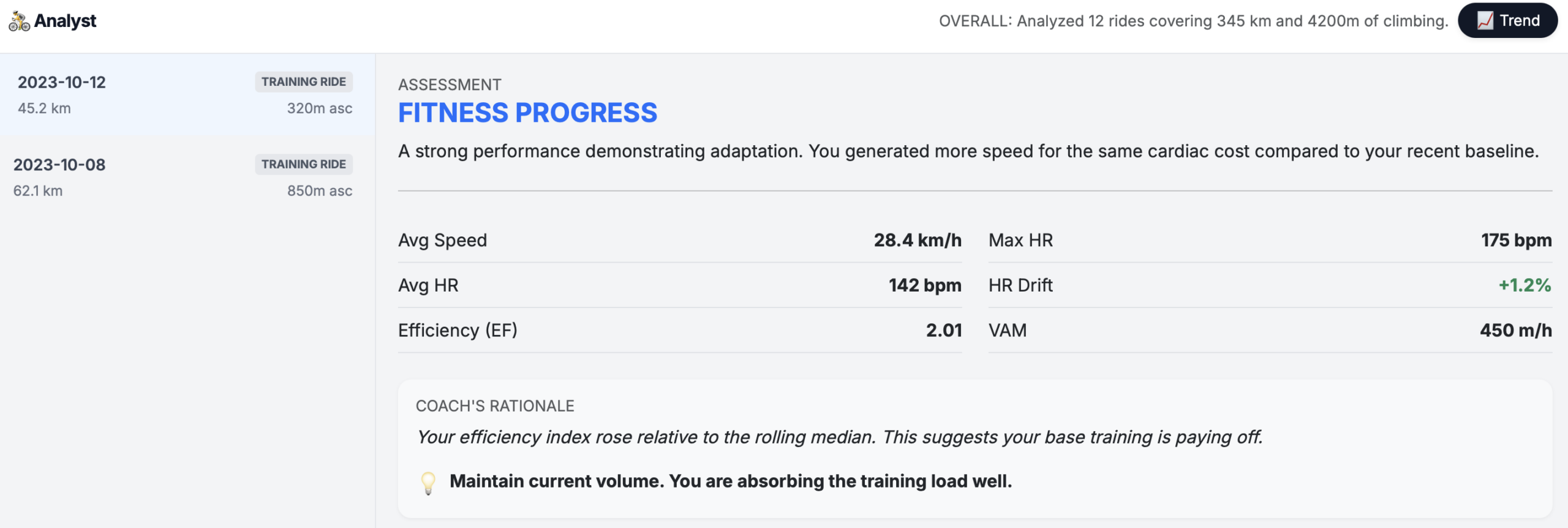
In the analysis shown above, an HR drift of +1.2% indicates strong cardiovascular stability – the rider maintained consistent cardiac output throughout the effort.
Why this matters: If you’re seeing high HR drift regularly, it’s a signal to focus on aerobic base building, regardless of what your speed or distance metrics show.
Step 2: Decode Efficiency Factor (EF)
Efficiency Factor is one of the most powerful metrics for tracking cycling fitness over time. It measures how much speed (or power) you generate per beat of your heart.
EF = Average Speed (or Normalized Power) ÷ Average Heart Rate
What the numbers mean:
| EF Value | General Interpretation |
| < 1.5 | Lower efficiency (hilly terrain, headwind, early-season fitness) |
| 1.5 – 2.0 | Moderate efficiency |
| 2.0 – 2.5 | Good efficiency |
| > 2.5 | High efficiency (often indicates flat terrain, tailwind, or strong fitness) |
In our example, an EF of 2.01 with the coach noting that “efficiency index rose relative to the rolling median” signals genuine adaptation. The rider is producing more speed for the same cardiovascular effort compared to their recent baseline.
Critical caveat: EF is highly route-dependent. A 2.0 EF on a mountainous ride represents far better fitness than a 2.5 EF on flat terrain with a tailwind. This is why my analyzer compares your rides against your own rolling baseline rather than arbitrary benchmarks.
Step 3: Analyze Climbing Performance with VAM
VAM (Velocità Ascensionale Media) measures your average climbing speed in meters of elevation gained per hour. It’s the gold standard for comparing climbing performance.
VAM = (Meters Climbed ÷ Time Spent Climbing) × 60
Reference ranges for recreational to competitive cyclists:
| VAM (m/h) | Level |
| 300-500 | Recreational fitness |
| 500-800 | Solid amateur |
| 800-1000 | Competitive amateur |
| 1000-1200 | Elite amateur / lower pro |
| 1200+ | Professional level |
The example shows a VAM of 450 m/h on a ride with 320m of climbing – solid recreational performance.
Why VAM matters: Unlike average speed, VAM normalizes for gradient differences. A 400 m/h VAM on a 12% grade represents similar fitness to a 400 m/h VAM on a 6% grade, even though your actual speed would be vastly different.
Step 4: Put Speed Metrics in Perspective
Average speed is the metric most cyclists obsess over – and the one most affected by external variables.
Factors that influence average speed (that have nothing to do with fitness):
- Wind direction and intensity
- Elevation profile
- Road surface quality
- Traffic and stop frequency
- Drafting (group riding)
- Temperature and air density
How to use speed meaningfully:
- Compare only on identical or very similar routes
- Track speed alongside heart rate (the EF relationship)
- Note environmental conditions
- Use as one input among many, never as the primary fitness indicator
The analyzer’s assessment framework handles this by weighting speed changes against heart rate changes – identifying when you’re genuinely faster versus when conditions simply favored a higher number.
Step 5: Interpret Power Estimates
Power output, measured in watts, is the most objective measure of cycling performance. Unlike heart rate, it’s not affected by fatigue, temperature, or caffeine.
What power metrics tell you:
- Average Power: Overall work rate (affected by coasting time)
- Normalized Power (NP): Accounts for variability – better represents metabolic cost
- Power Zones: Help structure training by intensity
Coming in a future version: Direct power estimate integration and power-to-heart rate analysis for users with power meters or Apple Watch power estimation enabled. For now, if you have a power meter connected to your Apple Watch, track the relationship between your average power and average heart rate over time. A rising power output at the same heart rate indicates improving fitness.
Step 6: Understand Cadence Patterns
Cadence – your pedaling revolutions per minute – influences both efficiency and fatigue.
General guidelines:
- 70-80 RPM: Higher muscular load, lower cardiovascular demand
- 85-95 RPM: Optimal for most cyclists; balances muscle and cardiovascular systems
- 95+ RPM: Higher cardiovascular demand, lower per-pedal muscular stress
Cadence choice affects other metrics: higher cadence typically raises heart rate slightly while reducing muscular fatigue on long rides.
Coming in a future version: Cadence analysis integration with heart rate efficiency scoring and pedaling pattern insights.
Step 7: Contextualize VO₂max Estimates
Apple Watch provides VO₂max estimates derived from your workout data. This metric represents your maximum oxygen uptake capacity – a key indicator of cardiovascular fitness.
Apple Watch VO₂max classifications (mL/kg/min):
| Age | Poor | Fair | Good | Excellent | Superior |
| 20-29 | <38 | 38-43 | 44-50 | 51-56 | >56 |
| 30-39 | <36 | 36-41 | 42-48 | 49-54 | >54 |
| 40-49 | <34 | 34-39 | 40-46 | 47-52 | >52 |
| 50+ | <31 | 31-36 | 37-42 | 43-48 | >48 |
Why raw VO₂max is tricky:
- Apple’s estimate is derived from heart rate and motion data – not direct measurement
- Single readings fluctuate based on workout type, conditions, and watch positioning
- Trend over months matters more than any individual number
Coming in a future version: VO₂max trend analysis correlated with training load and efficiency metrics for deeper fitness trajectory insights.
Why Structured Analysis Beats Raw Numbers
The core problem with cycling metrics is confounding variables. Every ride is different:
- Different route
- Different weather
- Different fatigue state
- Different equipment
- Different motivation level
When you look at a single ride’s numbers – or worse, compare disconnected rides – you’re seeing signal buried in noise.
Structured analysis solves this by:
- Establishing baselines: Your recent rolling median becomes your reference point, not arbitrary “good” or “bad” thresholds
- Multi-metric correlation: Combining HR, speed, elevation, and efficiency reveals patterns invisible in single metrics
- Trend detection: Progress becomes visible across 10-20 rides when single-ride variability averages out
- Contextual assessment: Labeling performances (fitness progress, maintained fitness, overreaching) based on your data, not generic standards
In the analysis shown above, the assessment “Fitness Progress” wasn’t based on any single impressive number. It emerged from the relationship: higher speed at the same cardiac cost compared to the recent baseline – the definition of genuine adaptation.
How to Get Your Own Structured Analysis
Our Apple Health Cycling Analyzer automates this entire process:
- Export your Apple Health data (Health app → Profile → Export All Health Data)
- Upload the export.zip file to the analyzer
- Receive instant structured analysis including:
- Efficiency tracking across rides
- HR drift analysis
- Climbing performance metrics
- Trend identification
- Coach’s rationale explaining why your rides indicate progress, maintenance, or overreaching
Privacy-first design: All processing happens in the RAM. Your health data is never uploaded to any server or stored anywhere.
Stop guessing whether you’re improving. Export your Apple Health data, run it through structured analysis, and let the relationships between your metrics tell the real story.
Leave a Reply